Decorator
@Builder
类似 react 中的纯 ui 组件「不能有状态」。
@Builder 是一个纯函数。
export interface BuilderDemoParams {}

@Builder
export function BuilderDemo(params: BuilderDemoParams) {
  Text('Hello World')
}
注意:参数传递存在 引用传递 和 值传递 的区分,值传递将不会同步状态的变化。
实际也很好理解,就是不可变数据和可变数据的区别。
建议所有的都按照对象去传递。
注意:多个参数,ui 也不会同步刷新,仅支持单个引用参数支持。
@LocalBuilder
同 @Builder 区别就是 this 指向不同。
@BuilderParam
类似 react 中的参数为 ReactNode 类型的参数。
修饰成员为构建函数「@Builder」。
@Builder function overBuilder() {}

@Component
struct Child {
  @Builder doNothingBuilder() {};
  // 使用自定义组件的自定义构建函数初始化@BuilderParam
  @BuilderParam customBuilderParam: () => void = this.doNothingBuilder;
  // 使用全局自定义构建函数初始化@BuilderParam
  @BuilderParam customOverBuilderParam: () => void = overBuilder;
  build(){}
}
@Styles
样式复用。
@Styles
function globalFancy () {
  .width(100)
}

@Entry
@Component
struct FancyUse {
  @State heightValue: number = 50;

  @Styles
  fancy() {
    .height(this.heightValue)
    .backgroundColor(Color.Blue)
    .onClick(() => {
      this.heightValue = 100;
    })
  }

  build() {
    Column() {
      Button('change height')
        .fancy()
    }
    .height('100%')
    .width('100%')
  }
}
@Extend
自定义属性对组件私有属性「包括事件、方法」拓展。
只能全局定义。
不同于 @Styles 其需要传递参数。
@Extend(Text) function fancy (fontSize: number) {
  .fontColor(Color.Red)
  .fontSize(fontSize)
}

@Entry
@Component
struct FancyUse {
  build() {
    Row({ space: 10 }) {
      Text('Fancy')
        .fancy(16)
      Text('Fancy')
        .fancy(24)
    }
  }
}
@Component
类似 react 中创建组件
其中包含的 build 类似 react 中的 render 函数「JSX 部分」。
组件装饰器。
@Entry
@Component
struct MyComponent {
  build() {
  }
}
@Entry
类似 react 中的 main.js 或 page/index.tsx 默认导出的路由组件
路由入口装饰器。
支持传递 EntryOptions 参数。
@Reusable
@Reusable装饰的自定义组件具备可复用能力。
@Require
必填校验,修饰组件属性。
@State
修饰状态。
@Prop
@Link
@StorageLink
@Watch
类似 react.useEffect 监听状态变化执行回调
@Entry @Component struct WatchTest {

  @State @Watch("onBasketUpdated") shopBasket: Array<number> = [7, 12, 47, 3];

  onBasketUpdated(propName: string): void {
  }

  build() {}
}
组件内置 props
stateStyles
类似变体,或者说 css 伪类
内置五中状态:
- focused:获焦态
- normal:正常态
- pressed:按压态
- disabled:不可用态
- selected:选中态
@Entry
@Component
struct MyComponent {
  @Styles normalStyle() {
    .backgroundColor(Color.Gray)
  }

  @Styles pressedStyle() {
    .backgroundColor(Color.Red)
  }

  build() {
    Column() {
      Text('Text1')
        .fontSize(50)
        .fontColor(Color.White)
        .stateStyles({
        	// with @Styles
          normal: this.normalStyle,
          pressed: this.pressedStyle,
        	// without @Styles
        	focused: {
            .backgroundColor(Color.Gray)
          }
        })
    }
  }
}
父子通信
V1:
只能传递常规的数据类型
- @Prop
- @Link
- @Observed & @ObjectLink
- @Provider & Consume
V2:
注意 @Prop 中无法传递函数,只能通过自定义属性的方式传递。
@Component
struct Child {
  onClose: () => void
}

@Component
struct Comp {
	build() {
    Child({ onClose: () => {} })
  }
}
此处需要注意 this 的指向问题,建议所有函数通过箭头函数的方式去做,fn() {} 这种方式创建的函数存在 this 问题,在传递的时候需要通过 bind,重新绑定 this 指向:
Child({ onClose: this.handleClose.bind(this)})
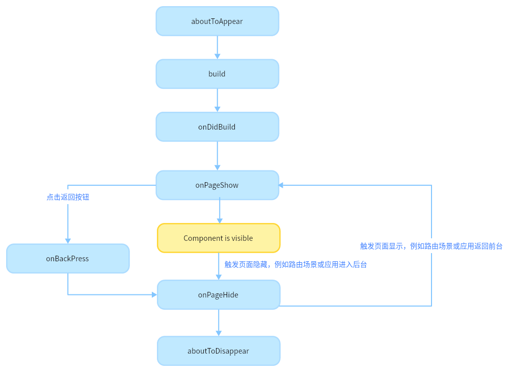
生命周期
注意:页面 -> 组件
页面生命周期,即被 @Entry 装饰的组件生命周期:
组件生命周期,即被 @Component 装饰的自定义组件的生命周期:
不建议在 aboutToDisappear 中执行异步操作,会产生闭包,导致组件不能完成垃圾回收。
组件生命周期类似 react 中的 beforeMounted、mounted、unMounted。